Abrint Nordeste
Building a brand identity that celebrates the resilience and technological leadership of Brazil’s Northeast.
Client
ABRINT
Type
• Brand Identity Design • Visual System Development • Logo Refinement • Event Brand Applications
Scope
• Brand Identity Design • Visual System Development • Brand Application
Website
Brasília, Brazil
Executive Summary
Abrint Nordeste is a major telecommunications event dedicated to internet service providers operating across Brazil’s Northeast region.
For the 2024 edition, the objective extended beyond visual refresh. The challenge was to strengthen regional positioning, elevate perceived strategic relevance, and counter longstanding stereotypes associated with the Northeast.
The solution was a culturally grounded brand system built on archetypal strategy, geometric coherence, and scalable visual architecture.
The Strategic Context
Brazil’s Northeast plays a crucial economic and geographic role in the country’s development. Despite its impact, the region is often perceived through outdated narratives.
Meanwhile, regional internet providers operate in complex environments, overcoming infrastructure challenges to expand connectivity across diverse territories.
The brand needed to:
Reinforce regional pride without romanticizing adversity
Position the Northeast as modern and strategically relevant
Align the event with technological advancement
Maintain coherence with the parent Abrint brand
This required not only aesthetic decisions but structural positioning.
Cultural Foundation
The Hero Archetype

The identity was anchored in the Hero archetype.
The Hero represents determination, resilience, transformation through effort, and forward momentum — qualities that mirror the trajectory of regional ISPs.
By positioning providers as protagonists rather than peripheral players, the identity reframed the event as a platform of agency and progress.Conceptual Framework
Brand Pillars
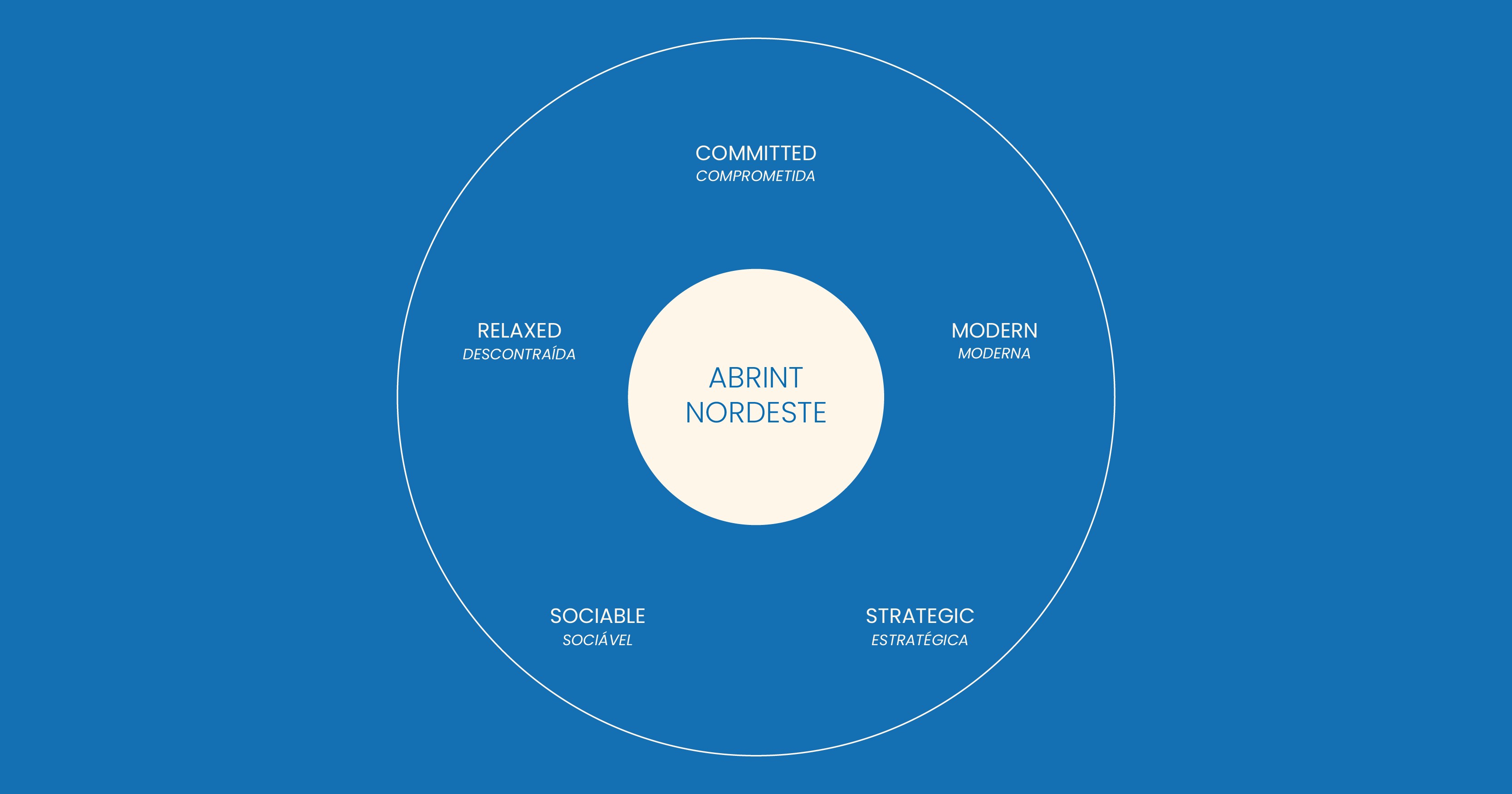
The visual and verbal system was structured around five pillars:
Committed: Long-term dedication to community and sector growth
Modern: Breaking outdated stereotypes through innovation
Strategic: Reinforcing geographic and economic relevance
Sociable: Collaboration and relational strength
Relaxed: Cultural warmth balanced with professional rigor
Each pillar informed design, hierarchy, tone, and visual rhythm.
Visual System Architecture
Geometric Foundation
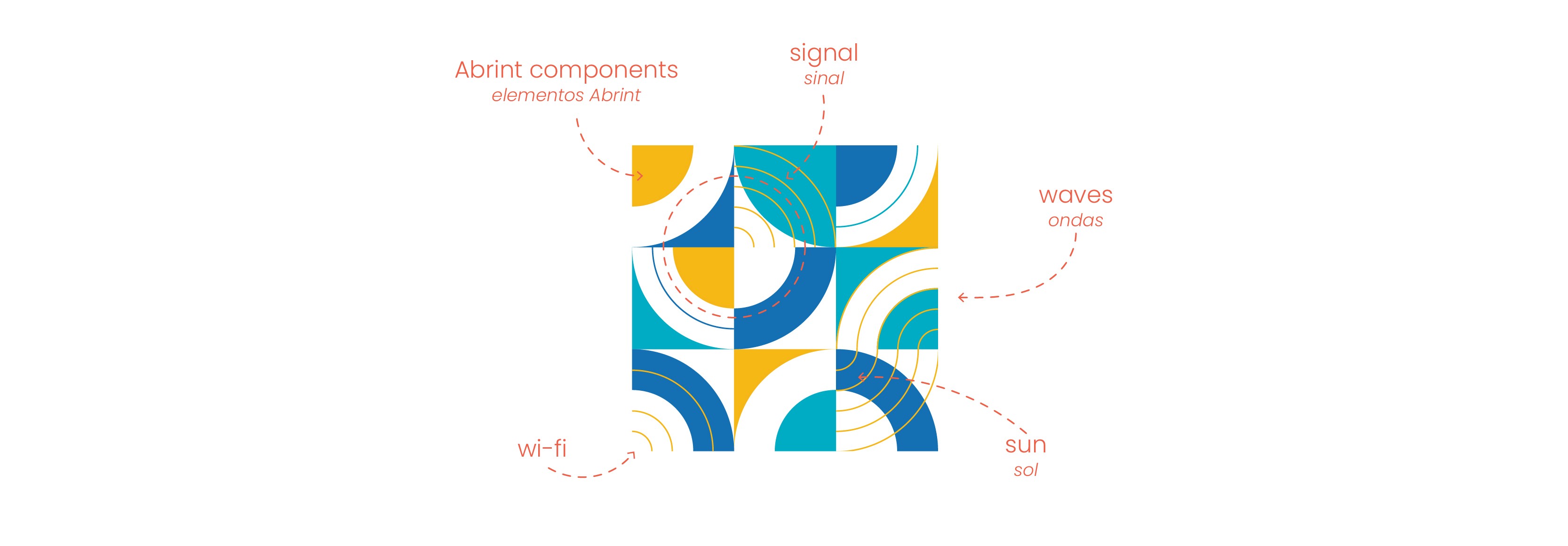
The existing Abrint identity is rooted in circular forms. Rather than replacing this language, the system expanded it.
A circular grid based on concentric structures became the compositional backbone. The circle functioned both structurally and symbolically representing connectivity, unity, focus, and momentum.
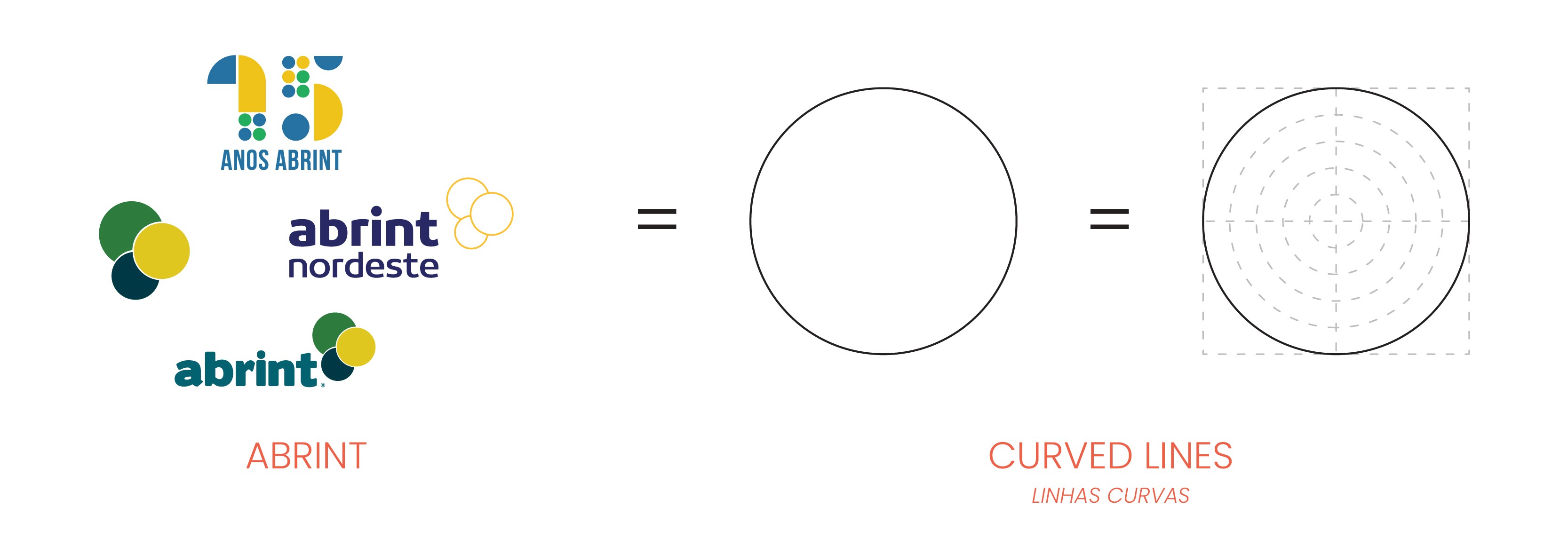
From this geometric logic, additional elements were derived:
Connectivity signals
Radial expansions
Solar references
Fluid forms inspired by coastal movement

The result is a structured yet dynamic visual language.
Color Strategy
The color palette balances institutional credibility with regional vibrancy:
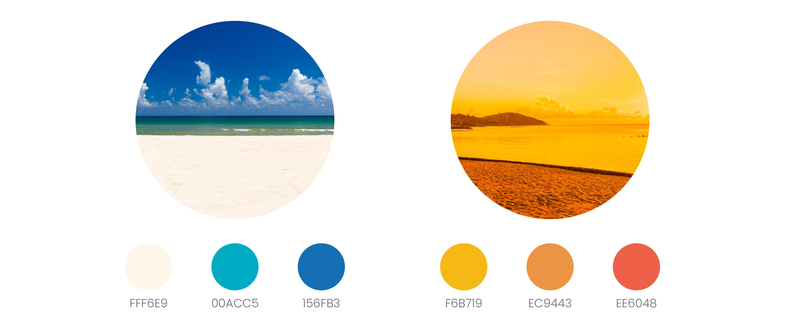
Sand-inspired neutrals for warmth and grounding
Sky and ocean blues for clarity and connectivity
Solar yellows for energy
Sunset reds and oranges for emotional intensity
The palette strengthens the Hero narrative by combining stability with momentum.
Pattern Development
The geometric system extended beyond composition and evolved into a proprietary pattern language.
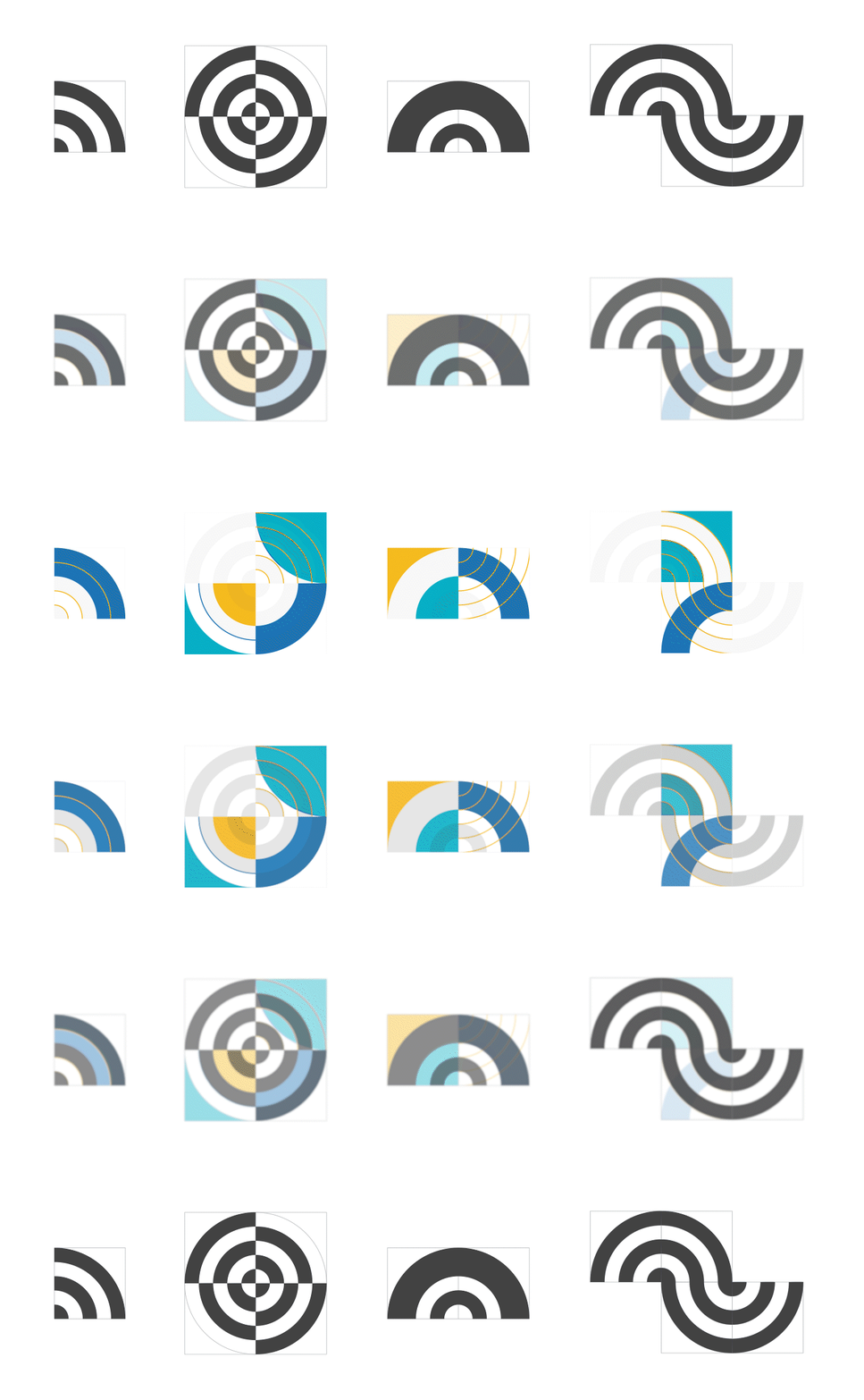
Derived directly from the circular grid and logo structure, the patterns translate connectivity and regional vibrancy into repeatable visual assets. Primary patterns emphasize structure and rhythm. Secondary patterns introduce fluidity and variation.
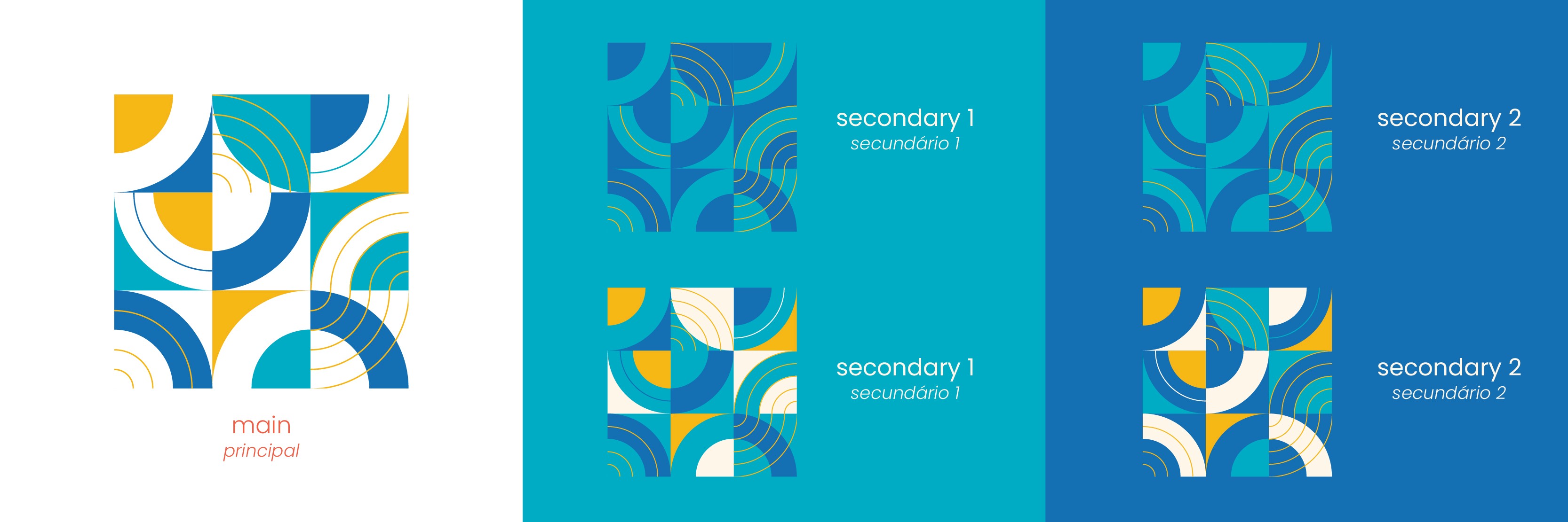
This system became one of the most recognizable elements of the identity, reinforcing cohesion across large-scale and small-format applications.
Logo Evolution
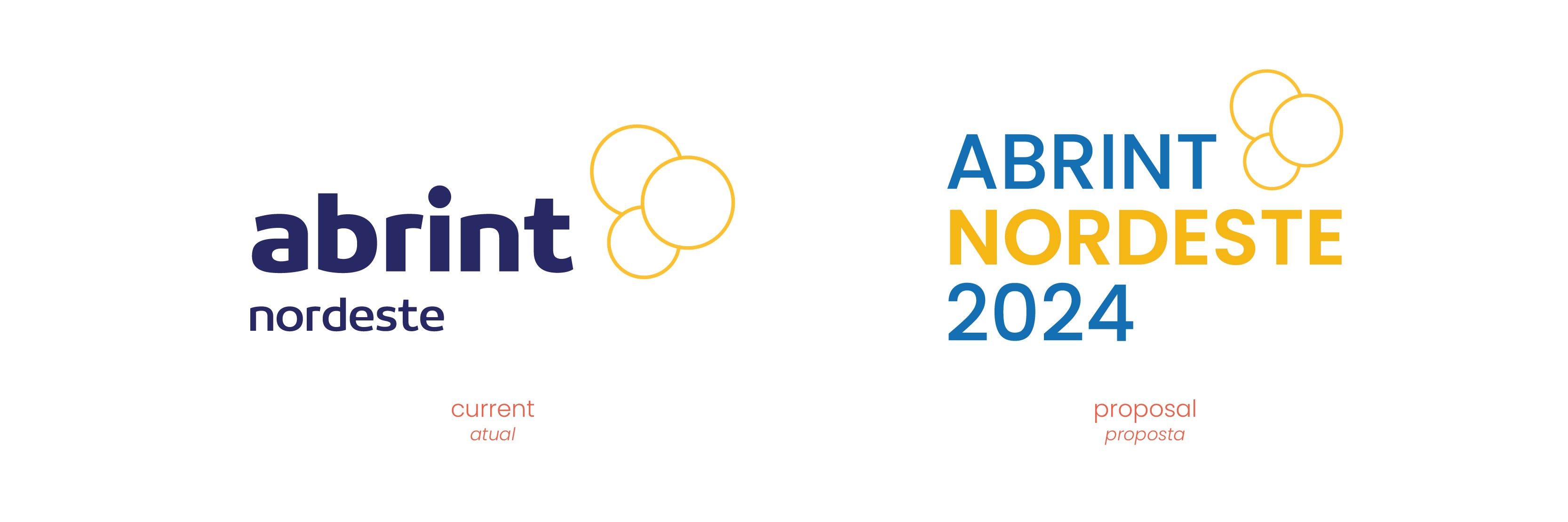
The logo redesign was approached as strategic refinement. The original Abrint structure was preserved to maintain brand equity and recognition. However, the hierarchy required adjustment to reinforce the event’s regional identity.
In previous versions, “Abrint” carried significantly more visual dominance than “Nordeste.” For 2024, both were aligned in scale and proportional weight to create a more balanced relationship between parent brand and regional expression.
“Nordeste” was set in bold to intentionally elevate its presence. Positioning it as a central protagonist rather than a secondary descriptor. The typeface Poppins was selected for the logo to reinforce modernity, geometric clarity, and contemporary tone consistent with the broader identity system.
Color was also integrated strategically. The logo incorporates tones derived from the regional palette, embedding place identity directly into the mark.
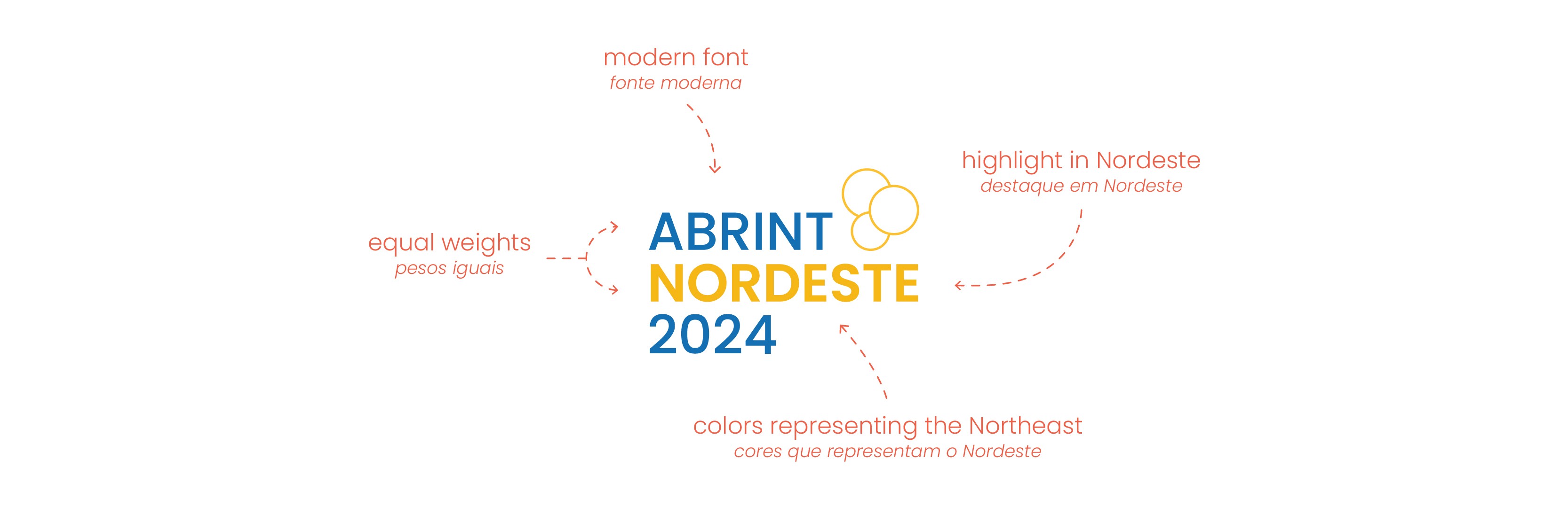
To ensure adaptability, a range of logo variations was developed including horizontal, stacked, and simplified formats. Allowing consistent application across digital, environmental, and print contexts.
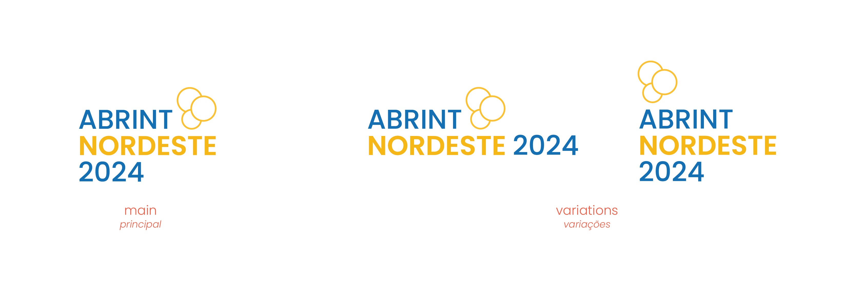
The result is an evolution that respects heritage while strengthening regional voice.
Typography
Poppins was selected for its geometric precision, clarity, and versatility across mediums.
Its contemporary structure reinforces:
Modernity
Accessibility
Clear hierarchy
Cross-platform consistency
Typography supports both strategic authority and cultural warmth.
Applications & System Scalability
The identity system was implemented across:
Environmental graphics
Event signage
Promotional materials
Gifts and merchandise
Badges and lanyards
Construction hoardings
Digital assets
Social media
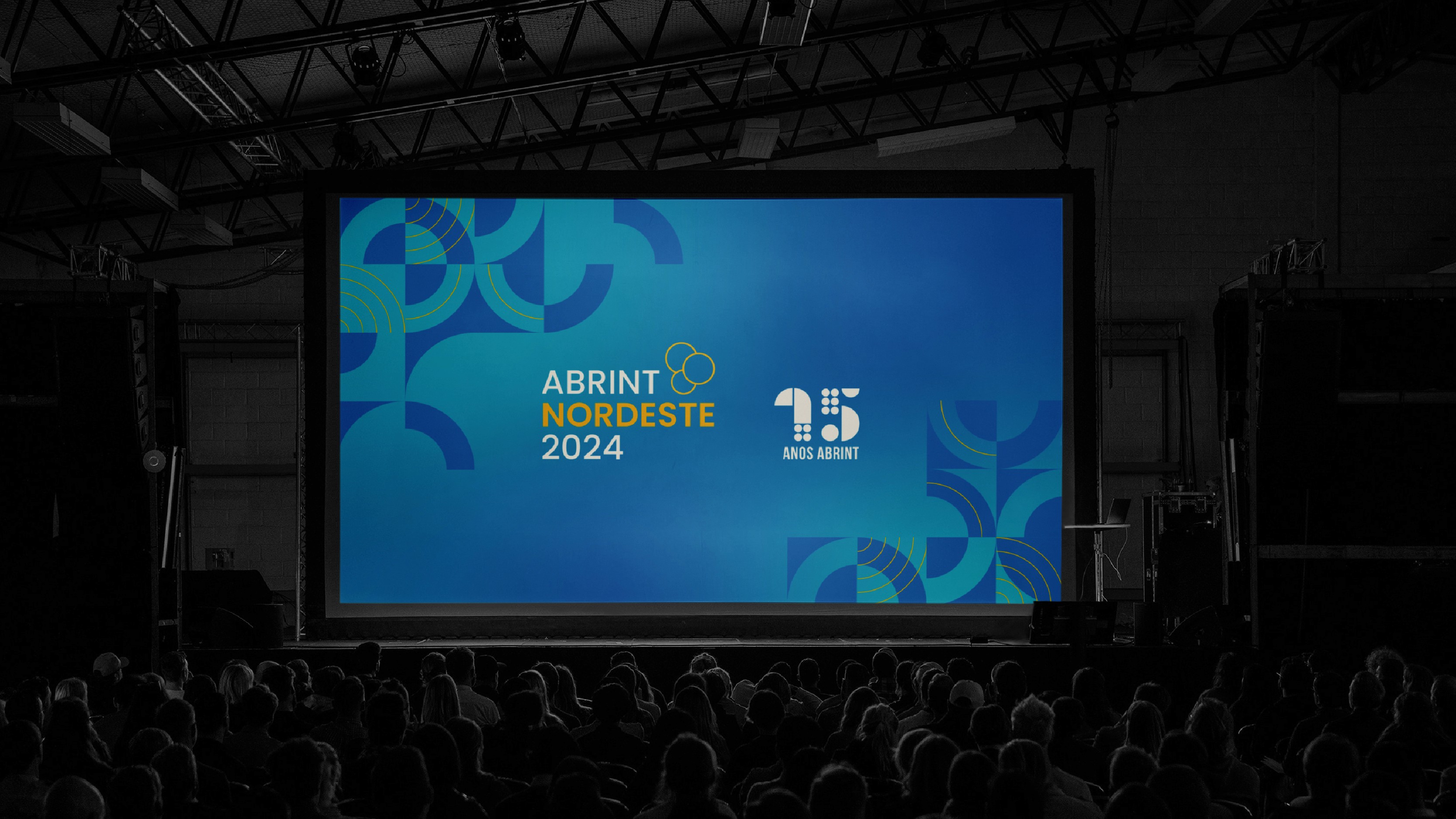
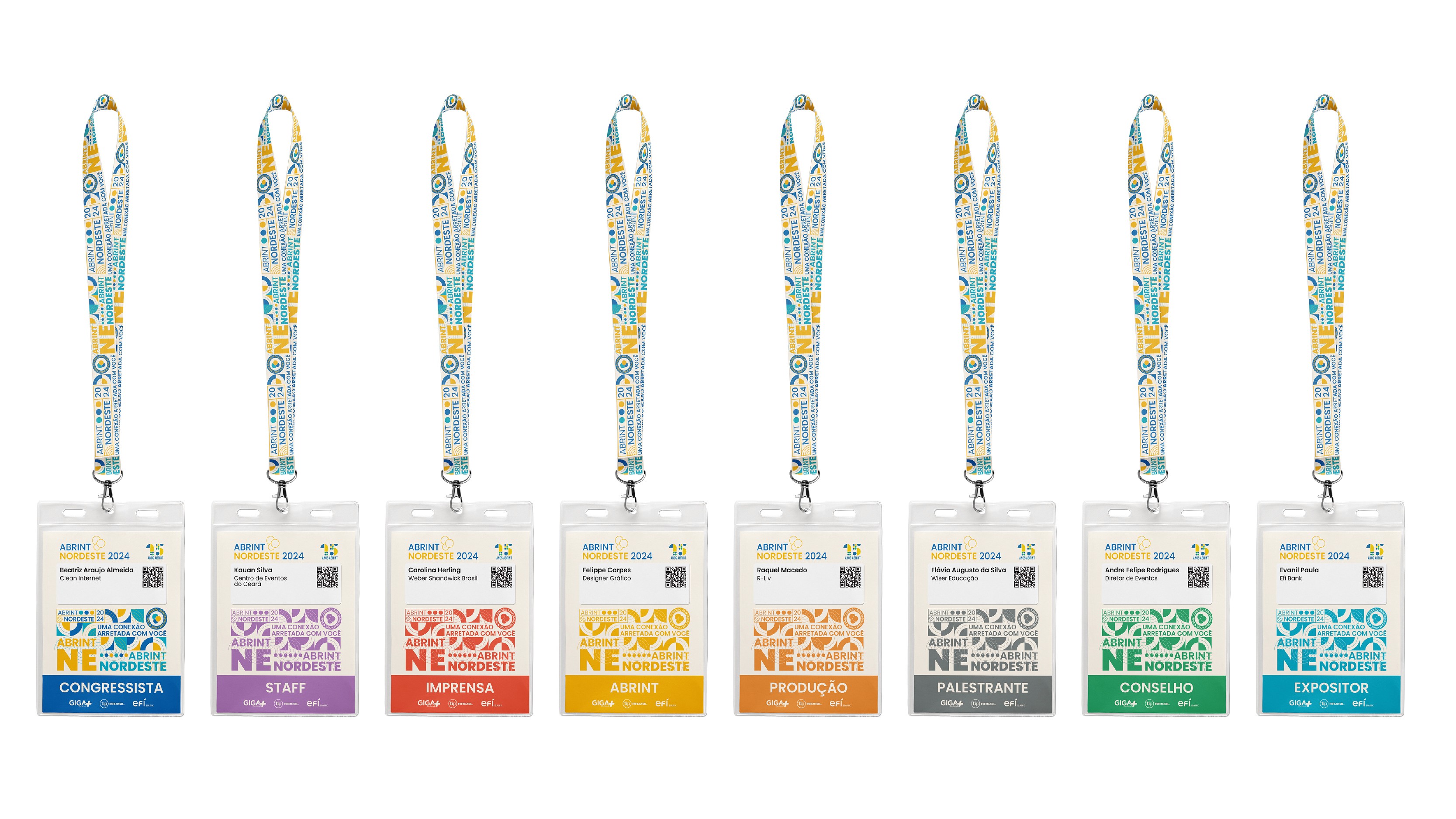
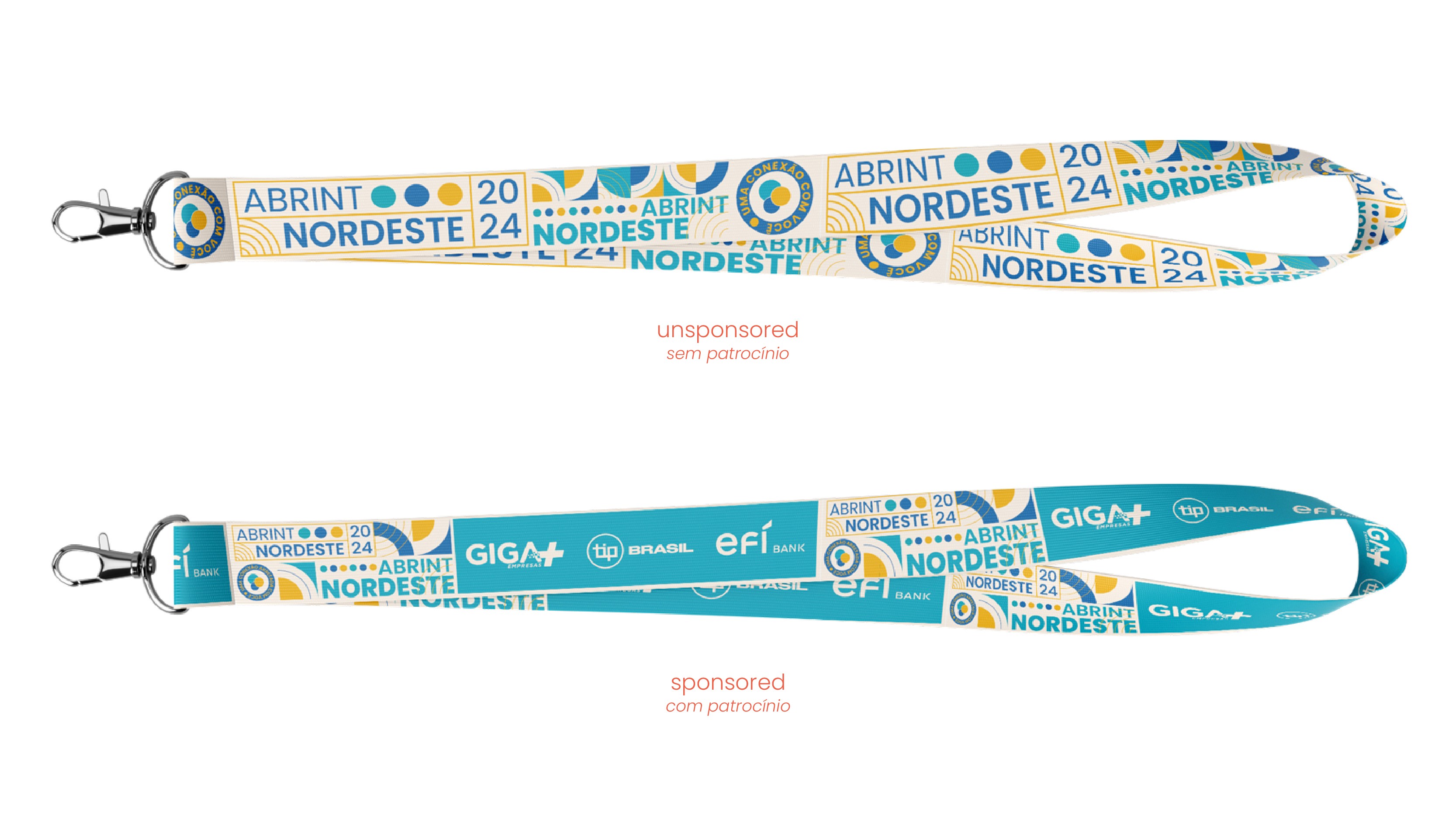
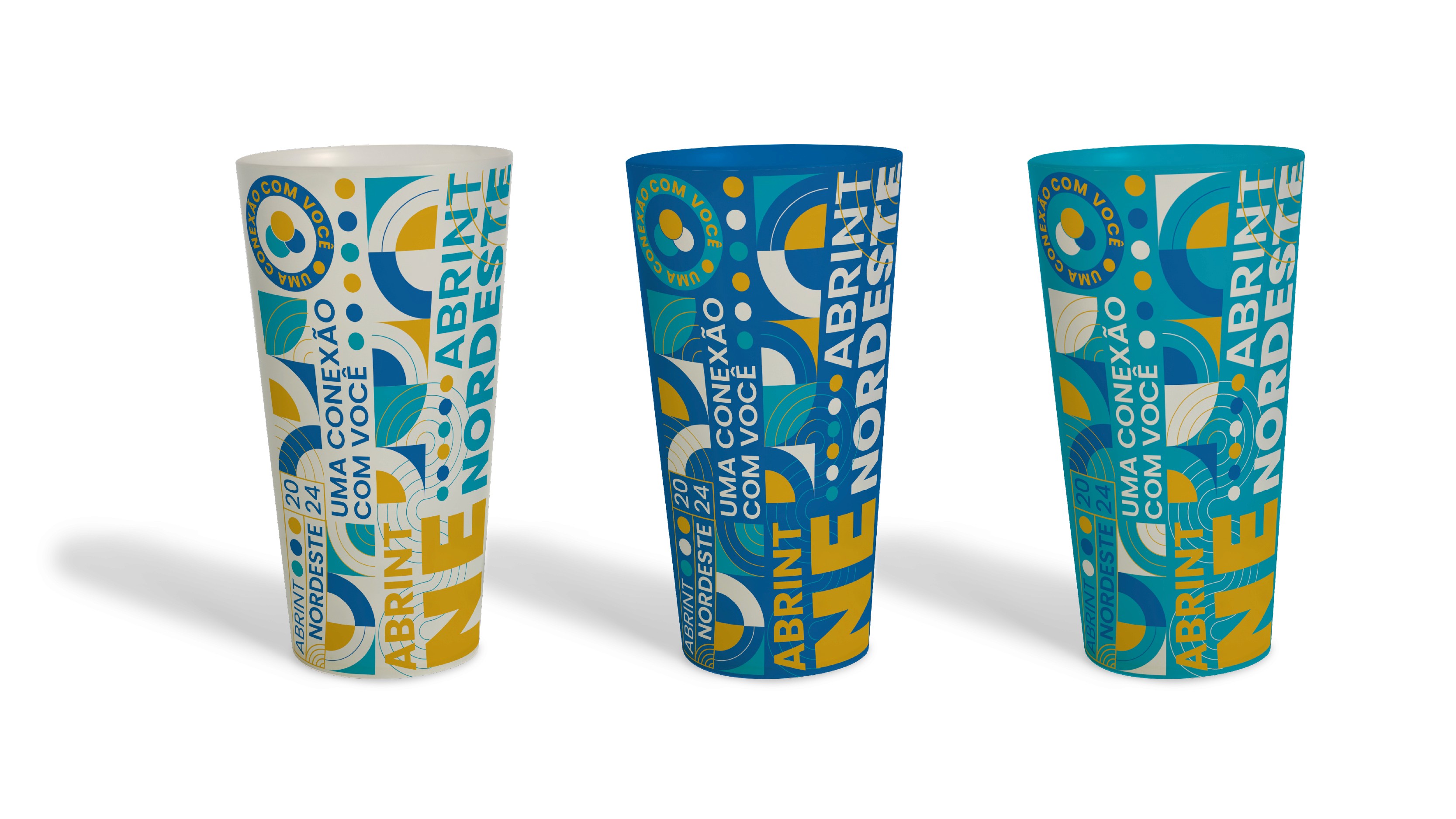
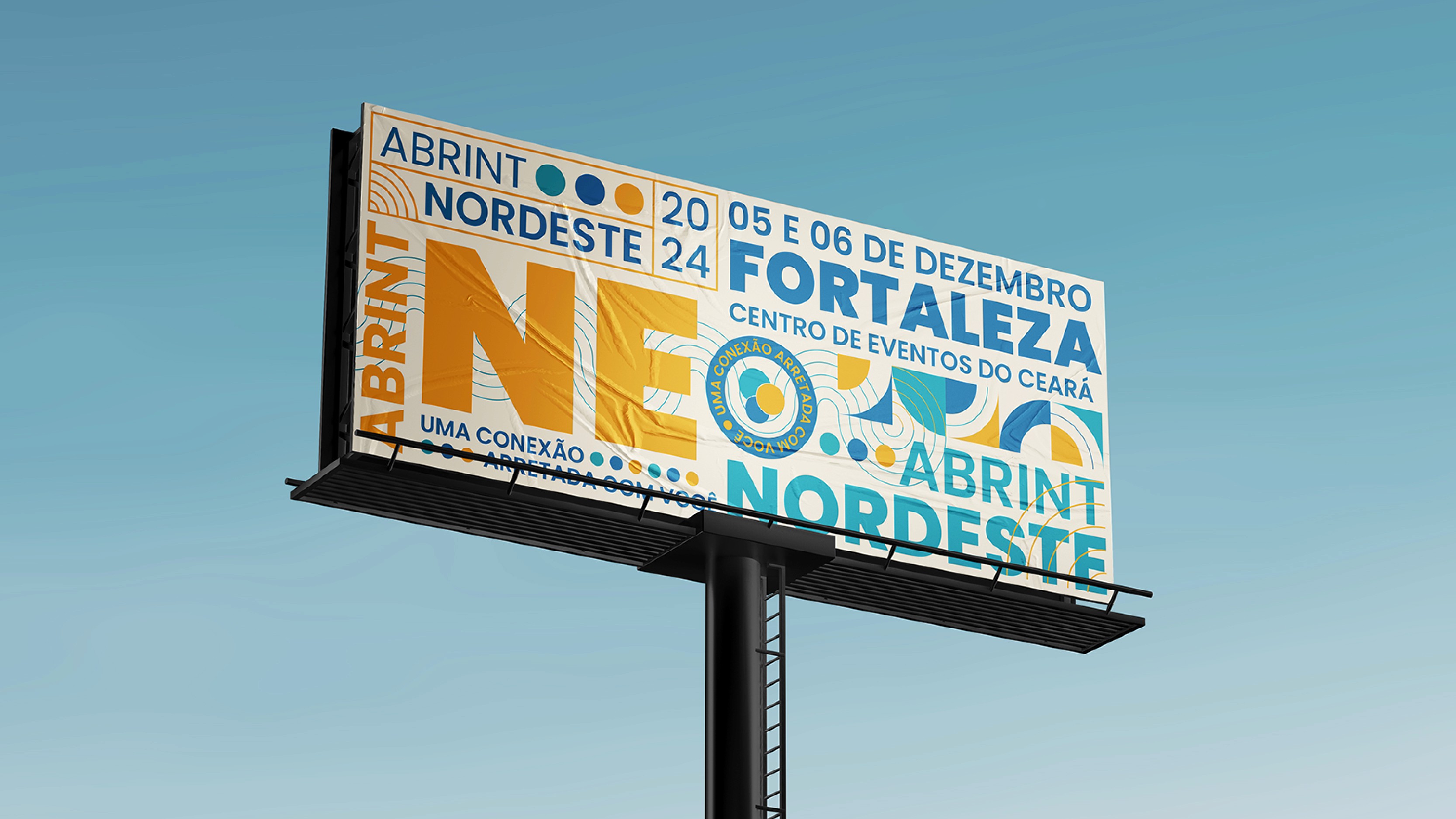
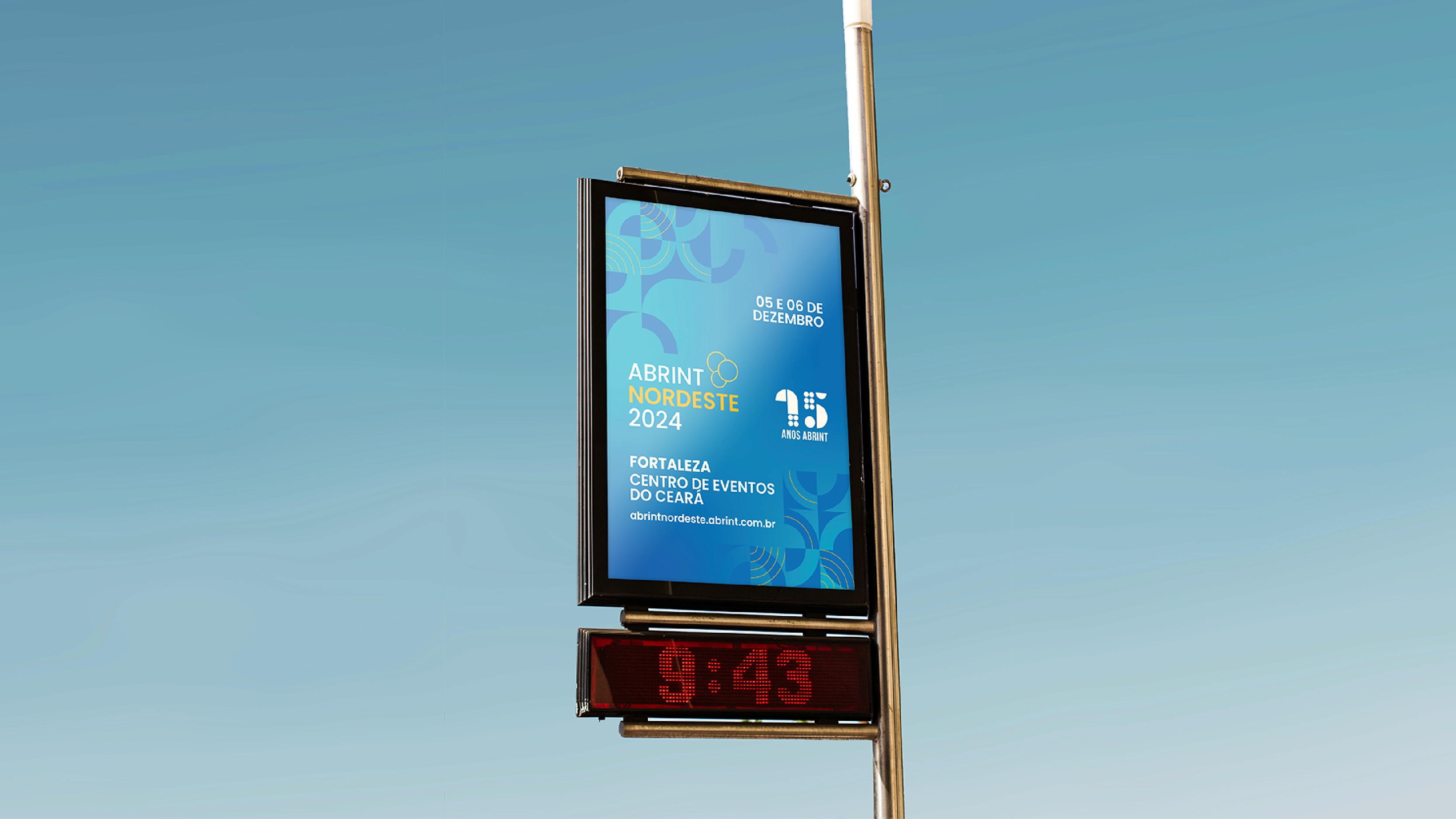


The circular grid and pattern system ensured consistency while allowing dynamic compositions adapted to different scales and surfaces.
The result was not a collection of assets but a coherent, expandable brand environment.
Impact
Early stakeholder feedback indicated:
Stronger emotional connection to regional pride
Increased perceived modernity
Clear differentiation from previous editions
Enhanced positioning of the event within the connectivity sector
The identity elevated Abrint Nordeste from a regional gathering to a strategically positioned industry platform.
My Role
Brand Strategy
Archetype Positioning
Cultural Narrative Development
Logo Redesign
Visual System Architecture
Pattern Creation
Typography & Color Strategy
Application Guidelines
Conclusion
Abrint Nordeste 2024 demonstrates how culturally informed strategy can elevate perception through structured design systems.
By combining archetypal positioning with geometric coherence and scalable application, the project repositioned a regional event as a symbol of resilience, modernity, and strategic relevance.
Design became positioning. Structure became narrative. Identity became agency.
RECENT WORKS