Abrint Global Congress - AGC
Repositioning Brazil’s largest ISP event for a global stage through strategic brand design.
Client
ABRINT
Type
• Brand Strategy • Visual Identity System • Logo Design • Event Brand Applications
Scope
• Brand Strategy • Visual Identity Design • Logo Design • Brand System Development
Website
Brasília, Brazil
Executive Overview
Abrint Global Congress (AGC) represents a defining moment in the evolution of the Brazilian connectivity ecosystem.
As the successor of Encontro Nacional Abrint, widely recognized as the largest internet service provider event in the Americas, AGC marks the transition from a nationally influential gathering to an event designed for global relevance.
The challenge was not simply to create a new visual identity. It was to design a brand system capable of honoring the legacy of the original event while positioning Abrint as a credible voice in the global technology and connectivity landscape.
The result was a strategic identity system rooted in knowledge, transformation, and transparency, guided by the Sage archetype.
Strategic Context
Abrint has long been a central force in Brazil’s ISP ecosystem. Through its events, the organization has created a platform where providers, technology companies, policymakers, and innovators meet to exchange knowledge and shape the future of connectivity.
With the continued growth of the sector and increasing international participation, the Encontro Nacional Abrint reached a turning point. The event needed to expand its scope and reposition itself as a global reference point.
AGC was conceived as that next step.
The new identity had to:
Preserve the credibility built over years
Communicate a clear step toward global relevance
Maintain the emotional connection with regional providers
Speak visually to an international audience
The key challenge was balancing continuity and transformation.
The Core Challenge
The transition from a national event to a global congress raised a fundamental question:
How do you communicate evolution without suggesting the past is being replaced?
The identity needed to express ambition and scale while still respecting the legacy that made the event successful in the first place. This balance became the conceptual foundation of the project.
Archetypal Positioning
The Sage
The event’s positioning is guided by the Sage archetype, a symbol of knowledge, discernment, and collective intelligence.
In an industry defined by constant technological change, the event acts as a trusted reference point — a space where insights are shared, ideas are challenged, and the future of connectivity is shaped through knowledge.
The Sage archetype reflects Abrint’s role in the sector:
guiding with expertise
connecting collective intelligence
transforming knowledge into actionable insight
AGC therefore becomes not just a conference, but a platform for learning, discussion, and strategic direction.
Brand Pillars
The identity system was structured around three fundamental pillars.
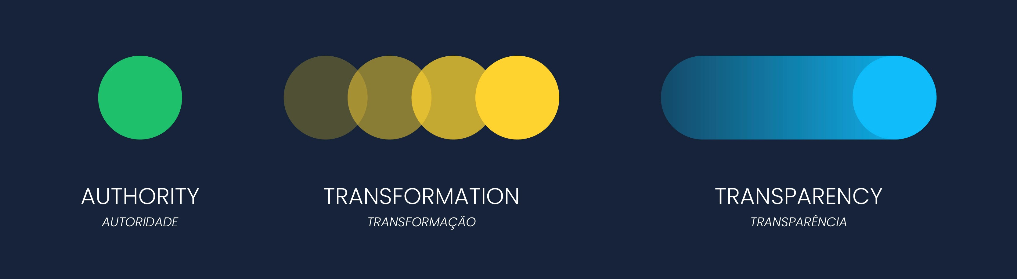
Authority
Authority reflects Abrint’s credibility and leadership within the connectivity ecosystem.
Rather than dominance, authority here represents trust and legitimacy. AGC provides access to industry experts, global trends, and strategic insights, reinforcing Abrint as a guiding force within the sector.
Transformation
Transformation reflects the dynamic nature of the connectivity industry.
AGC is designed as a space where ideas move from theory to implementation. The event encourages innovation, challenges existing paradigms, and supports providers in adapting to technological and market shifts.
Transparency
Transparency reinforces the importance of open dialogue.
The event promotes honest conversations between providers, policymakers, technology companies, and stakeholders. Through transparent discussions about regulation, market practices, and technological impact, AGC strengthens trust across the ecosystem.
Naming Strategy
The name Abrint Global Congress was designed to reflect both continuity and ambition.
Abrint
Abrint remains the core of the name, preserving the credibility and recognition the organization has built over more than a decade. Maintaining the name reinforces continuity and trust within the community.
Global
The term “Global” communicates the event’s expanded scope.
It signals the intention to connect regional markets with international perspectives, attracting participants from different countries, cultures, and sectors.
Congress
The word “Congress” emphasizes depth and seriousness.
It communicates that AGC is not simply an exhibition or networking event, but a platform for meaningful discussions, strategic insights, and knowledge exchange.
Together, the name positions the event as both globally relevant and deeply rooted in Abrint’s legacy.
Logo & Identity Design
The AGC logo was conceived as a synthesis of continuity, transformation, and global ambition.
Historically, Abrint’s events maintained the organization’s logo as a central visual element. For AGC, the design expands that identity while preserving its foundational language.

The Power of the Acronym
An analysis of major international events, such as MWC, CES, SXSW, and IGF. Reveals the strategic importance of acronyms in global brand recognition.
Inspired by this pattern, the acronym AGC became a central element of the visual identity, reinforcing memorability and positioning the event alongside other globally recognized industry gatherings.
Logo Design Rationale
The mark combines conceptual depth with visual simplicity.
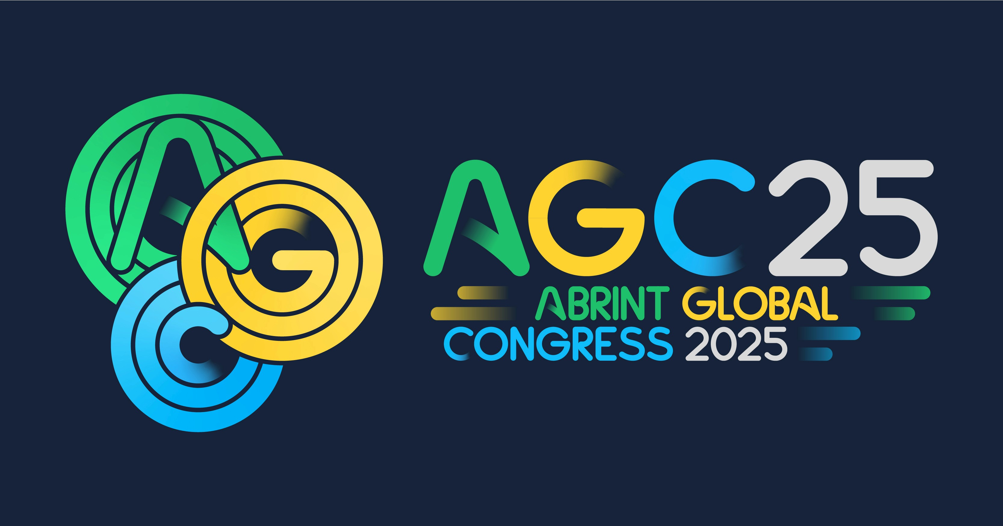
Circular Geometry
The circle, a central element in Abrint’s identity, was reinterpreted as a symbol of transformation.
Fluid circular lines form the letters A, G, and C, expressing both continuity and evolution.
Abrint’s Core Colors
The brand’s traditional colors: green, yellow and blue. Were preserved to maintain strong visual continuity and reinforce belonging within the Abrint ecosystem.
Transparency as Design Language
Subtle transparency at the edges of the letters reflects one of the event’s core pillars: Transparency.
This visual device also introduces a contemporary aesthetic aligned with international design standards.
Emphasis on the “A”
The letter A, representing Abrint, carries greater visual weight within the acronym. This reinforces the organization as the origin and driving force behind the event.
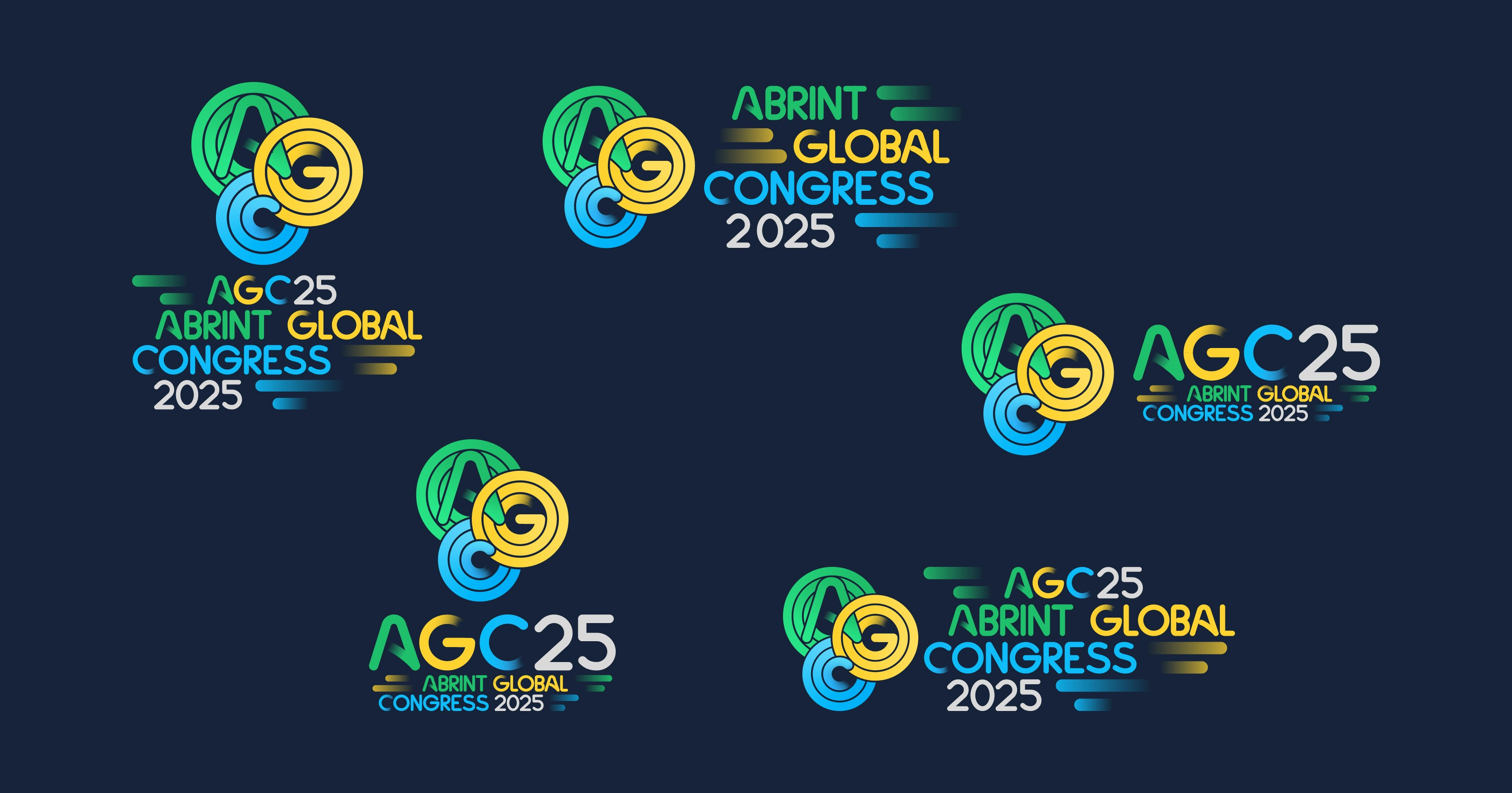
Logo Variations
To ensure flexibility across different contexts and formats, a range of logo variations was developed. These variations allow the mark to adapt seamlessly to different applications such as digital platforms, printed materials, and large-scale environmental graphics. While maintaining visual consistency and brand recognition.
Visual Identity System
Motion as Transformation
The visual identity expands the circular language of the logo into a dynamic graphic system.
Circles move, transform, and create visual trails across compositions.
This movement symbolizes:
the pursuit of innovation
the evolution of technology
the expansion of ideas and networks
The resulting visual language communicates energy, momentum, and transformation while maintaining coherence with Abrint’s established identity.
Typography
Typography was carefully selected to balance distinctiveness and usability.
Custom Typography
A bespoke typographic approach was developed for the event name and acronym, ensuring a unique visual signature aligned with the identity’s geometric and fluid language.
Supporting Typeface
For supporting communication materials, the typeface Manrope was selected due to its clarity, versatility, and modern structure.
This combination creates a balance between visual distinction and functional communication.
Identity in Application
To ensure the identity system extended beyond the logo, the AGC visual language was implemented across a wide range of event touchpoints.
The identity was applied to promotional and operational materials including:
attendee badges
lanyards
promotional merchandise and gifts
social media campaigns
outdoor advertising and billboards
event signage and environmental graphics
printed materials and communication assets


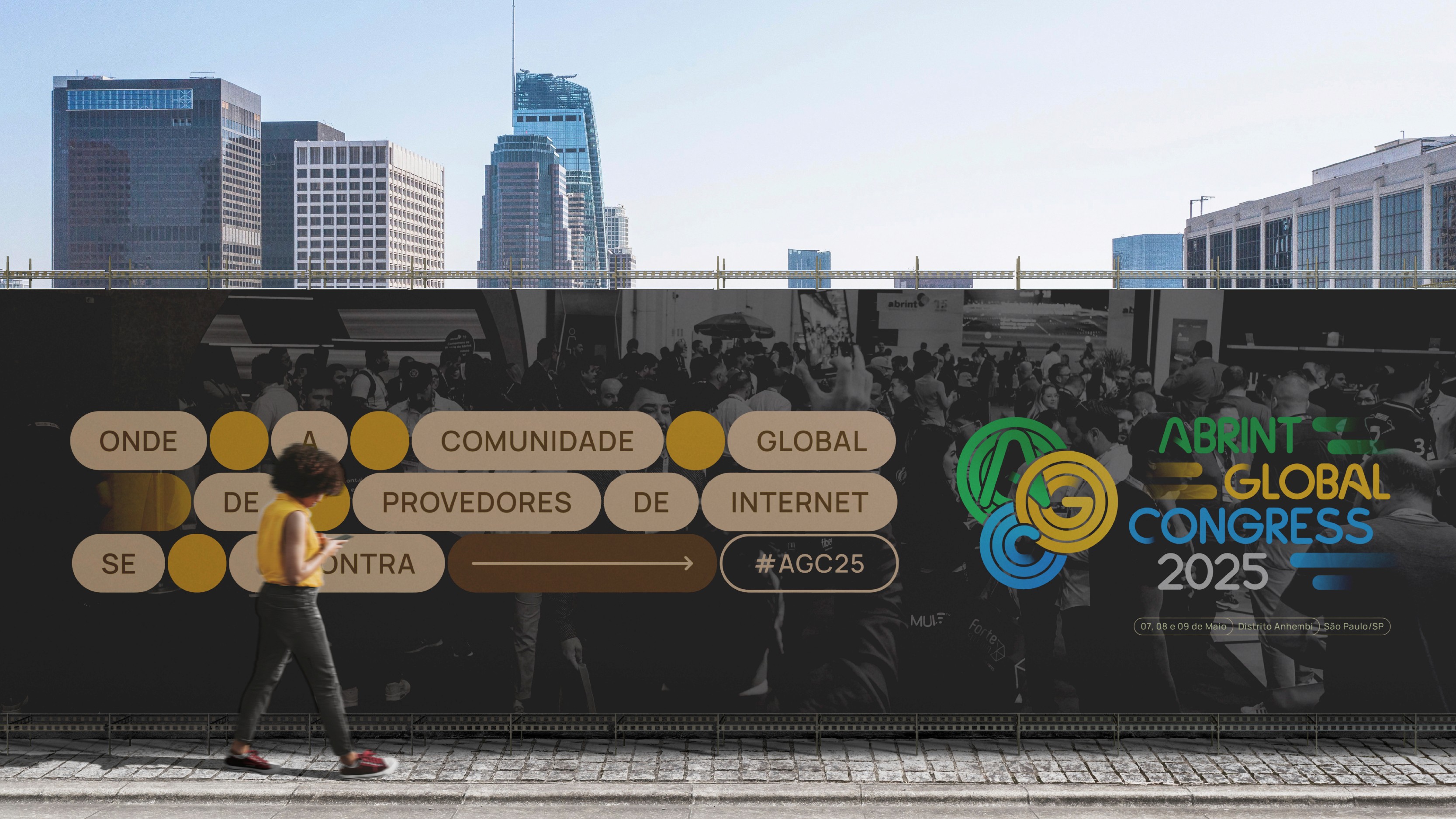

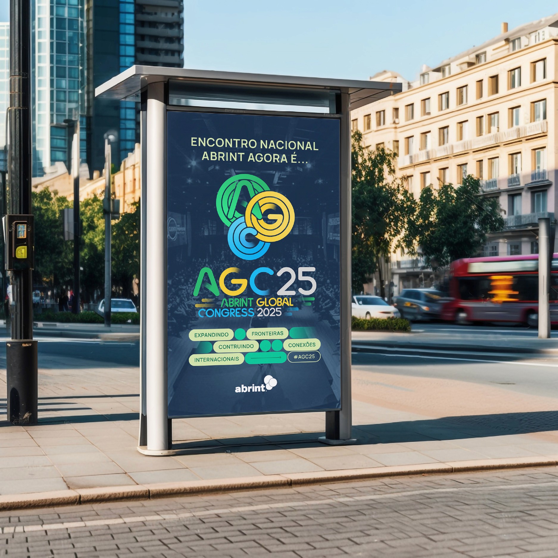
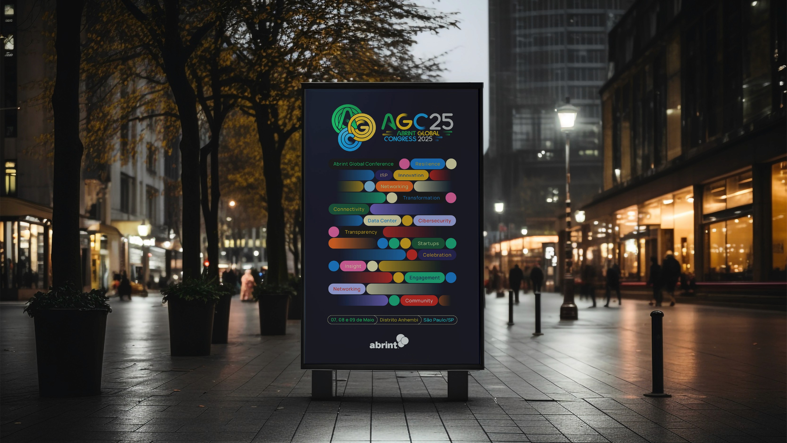
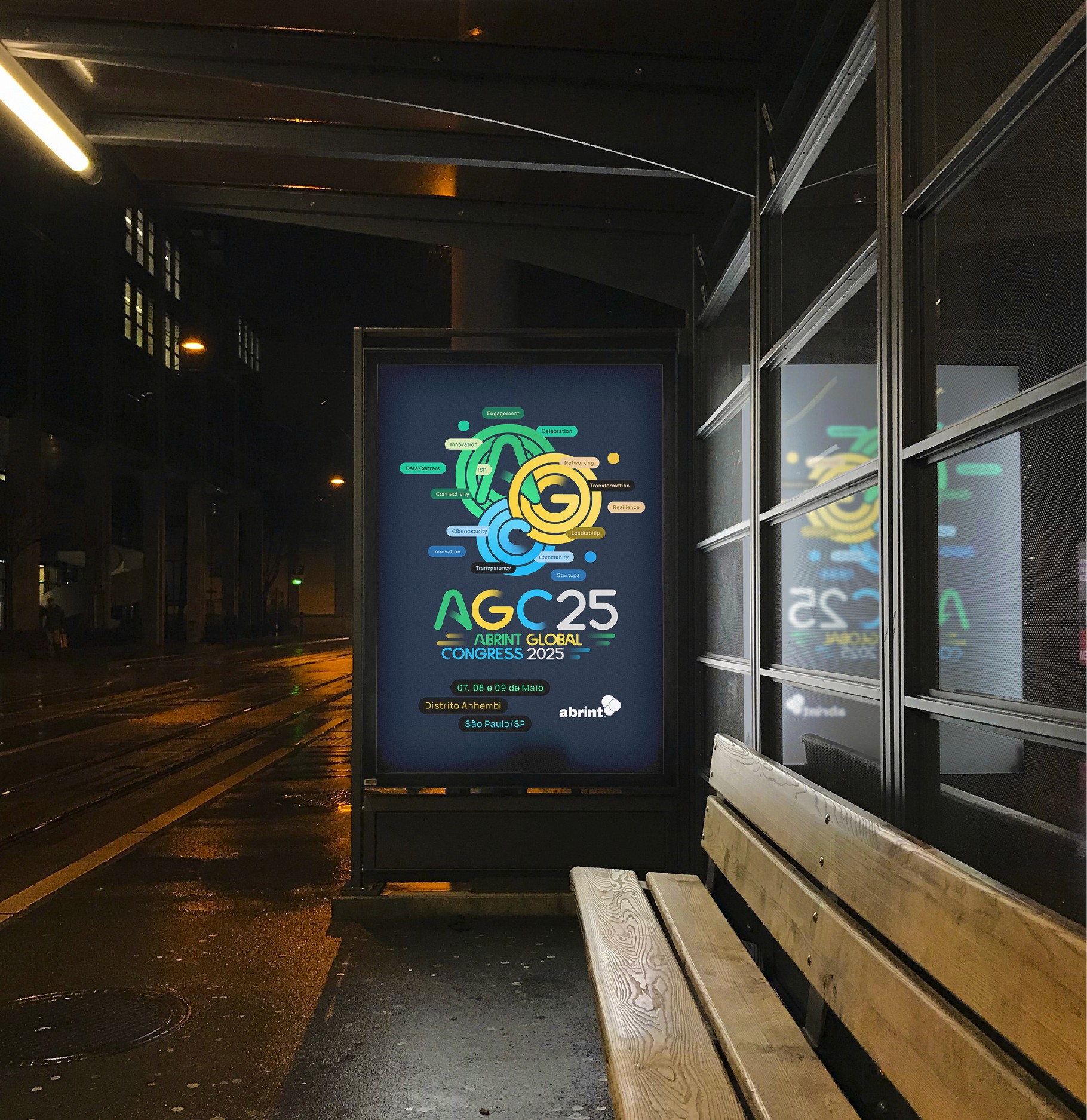

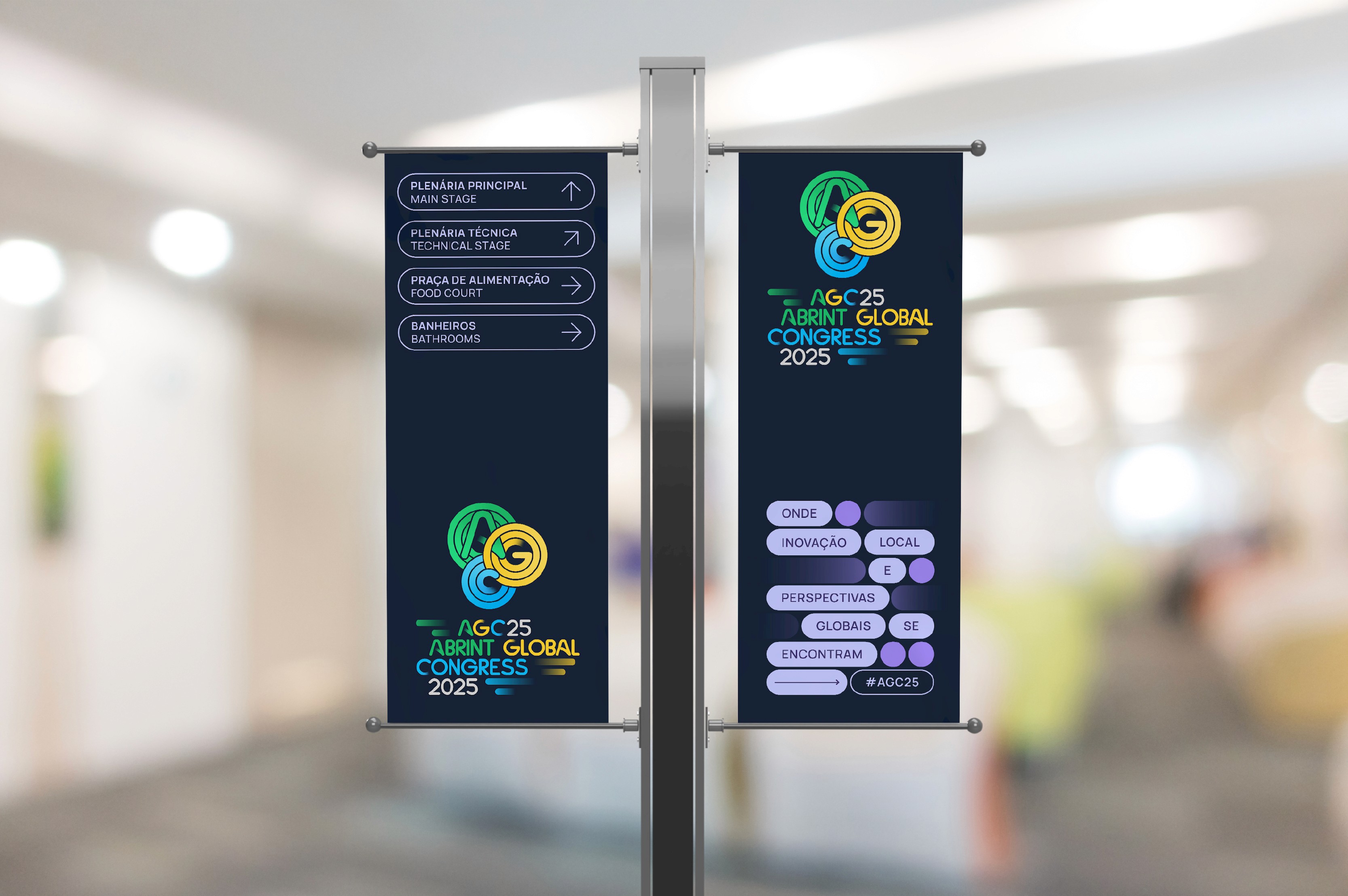
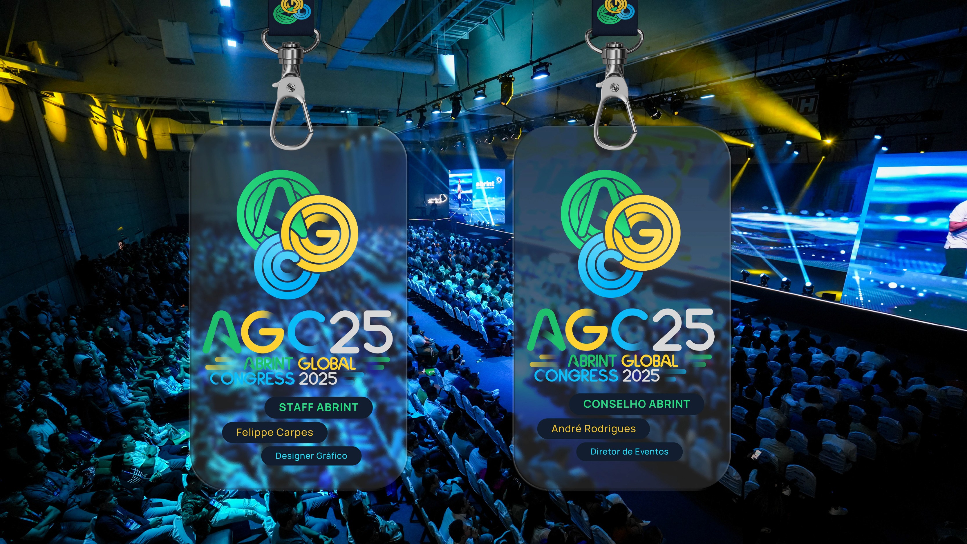
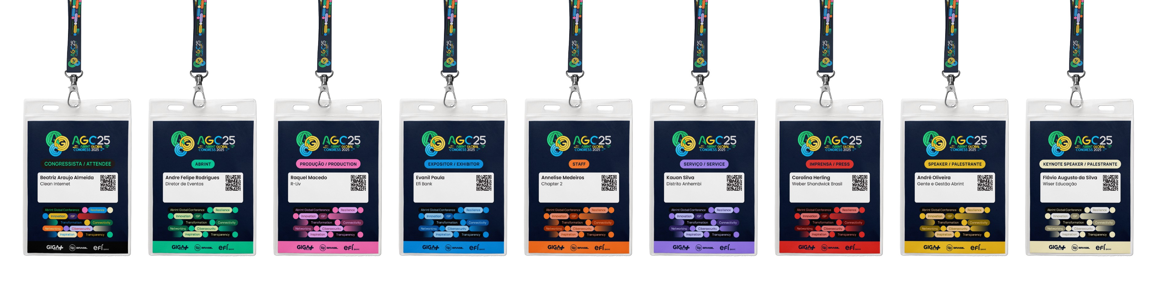
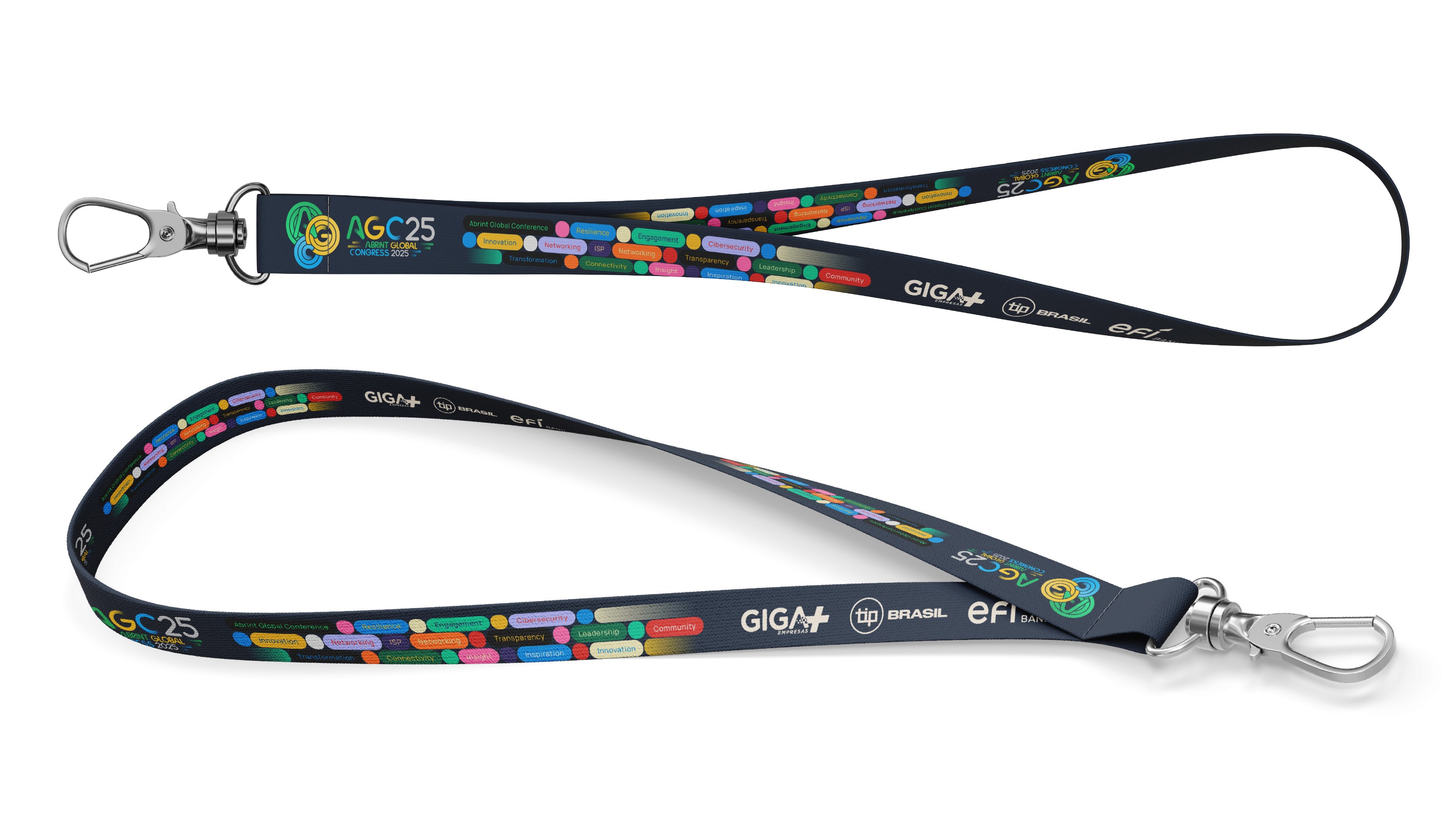
These applications transformed the brand from a visual concept into a complete event environment.
Across every touchpoint. From attendee credentials to large-scale outdoor communication the identity reinforces AGC’s positioning as a contemporary, globally oriented technology event.
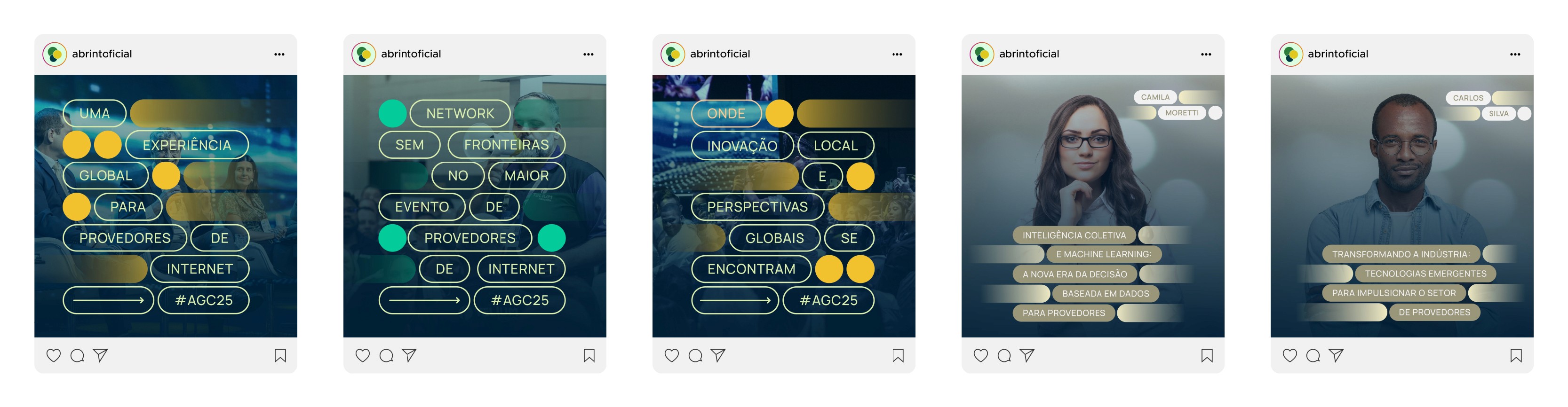
Social Media Communication
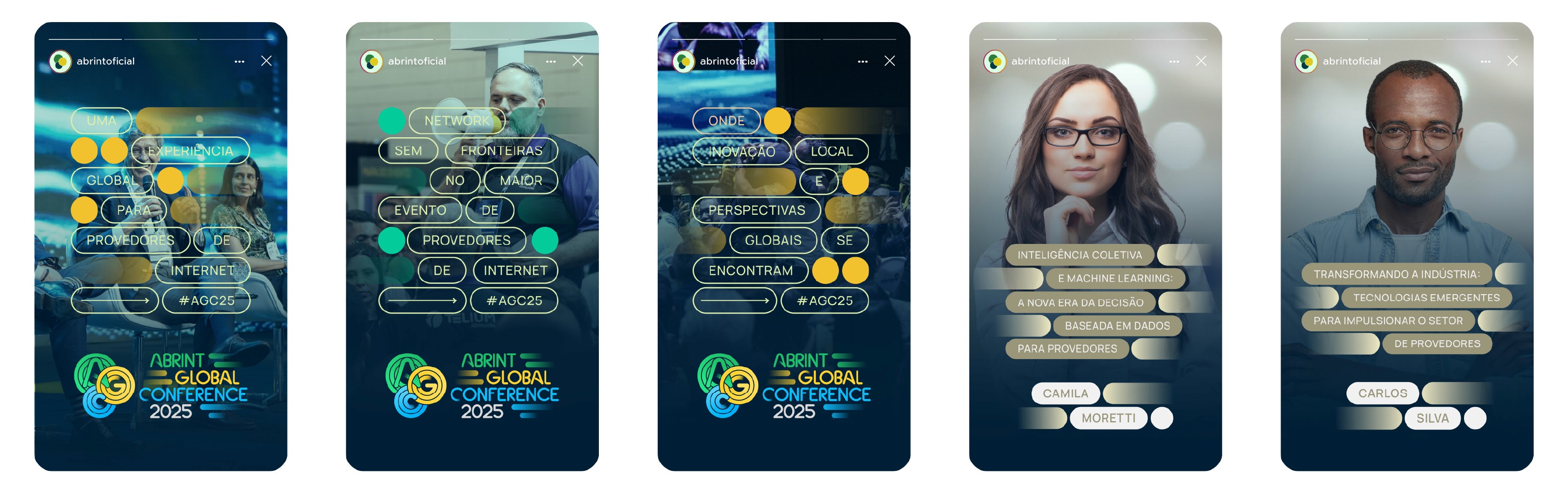
The AGC visual identity was also designed to perform effectively across digital communication channels, particularly social media.
Custom templates were developed for Instagram posts and stories, allowing the brand’s dynamic circular language and motion-inspired compositions to translate seamlessly into short-form digital formats. These assets supported event announcements, speaker highlights, program updates, and promotional campaigns leading up to the congress.
By maintaining consistent typography, color structure, and graphic movement, the social media content reinforced the brand’s visual coherence while enabling flexible communication. This ensured that AGC maintained a recognizable presence across digital platforms, extending the identity beyond the physical event environment and into ongoing audience engagement.
Outcome
AGC represents a pivotal step in Abrint’s trajectory.
The new identity successfully communicates the evolution from a nationally focused gathering to a globally oriented congress while maintaining the credibility and trust built over years of industry leadership.
More than a visual redesign, the project establishes AGC as a platform for knowledge, collaboration, and transformation within the global connectivity ecosystem.
My Role
Brand Strategy Translation
Archetype Positioning
Logo Design
Visual Identity System
Typography Direction
Brand Application Guidelines
Promotional Material Design
RECENT WORKS