Employee Handbook Redesign
Transforming Internal Guidelines into an Engaging Onboarding Publication
Client
Imex Medical
Type
• Editorial Design • Information Design • Employee Onboarding Material • Illustrated Document Layout
Scope
• Editorial Design • Information Structuring • Visual Layout Development
Website
São José, Brazil
Executive Overview
Imex Medical, a Brazilian company operating in the healthcare technology sector, required the redesign of its internal onboarding handbook used to introduce new employees to company policies, workplace guidelines, and daily practices.
The original document contained essential information for new hires, but its presentation was largely text-based and lacked visual engagement.
The objective of the project was to transform this document into a more approachable and visually engaging publication while preserving the clarity and practicality required for internal communication.
The Challenge
Employee onboarding materials play an important role in shaping a new employee’s first interaction with company culture.
However, when presented as dense blocks of text, these documents often become difficult to read and less effective as communication tools.
The challenge was to redesign the handbook so that it would:
improve readability and engagement
communicate guidelines clearly and efficiently
reflect the company’s brand personality
create a welcoming first experience for new employees
Design Approach
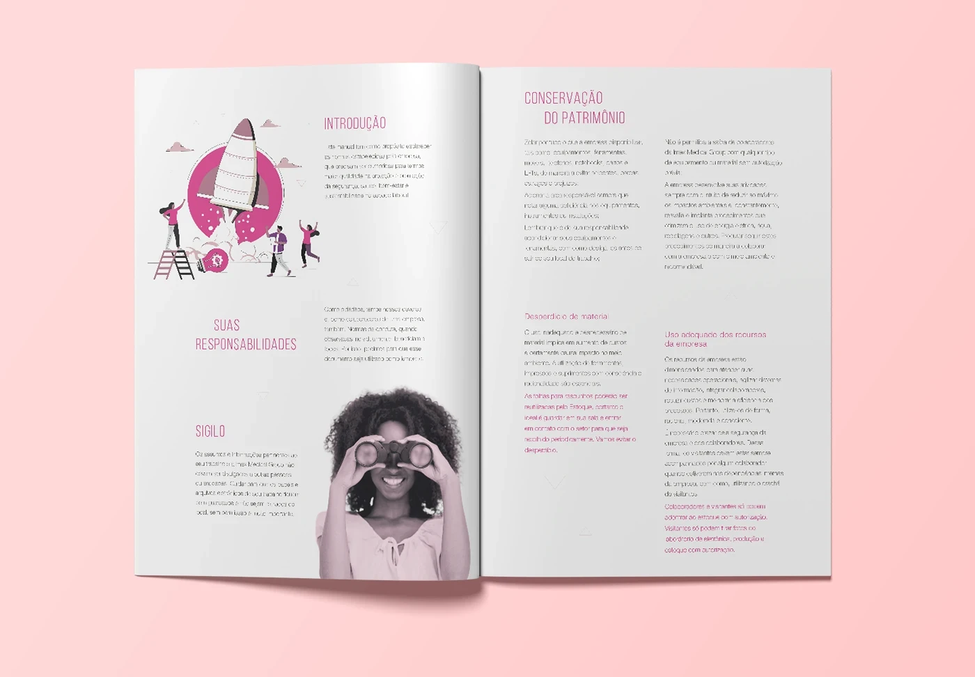
The redesign focused on transforming the handbook into a visually friendly and accessible document.
Flexible Layout Structure
Unlike highly rigid editorial layouts, the design adopted a more flexible composition.
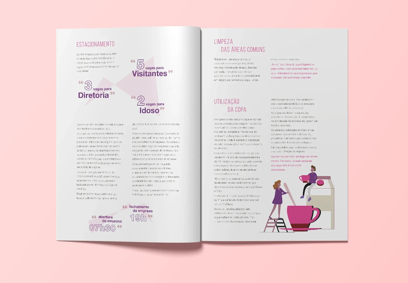
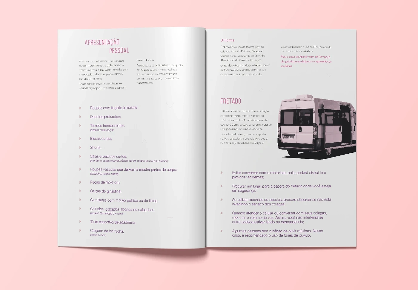
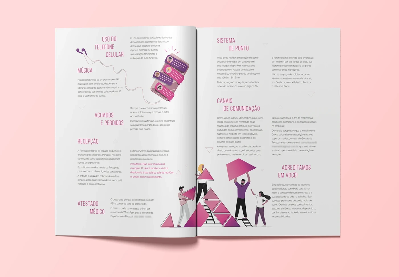
Text blocks were arranged in relation to illustrations and visual elements, allowing each page to adapt organically to the content and visual storytelling.
This approach created a dynamic and engaging reading experience rather than a repetitive page structure.
Illustration Integration
Illustrations played a central role in the design.
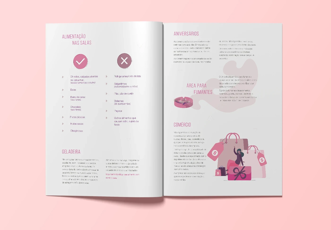
They helped communicate everyday workplace guidelines such as the use of shared spaces, workplace etiquette, and internal policies in a lighter and more accessible way.
This visual layer helped reduce the formality typically associated with corporate manuals.
Color System
The color palette was derived from the company’s brand identity, particularly shades of pink and purple, which are part of Imex Medical’s visual language.
These colors were used to create visual consistency with the company’s brand while also adding warmth and vibrancy to the document.
Clear and Concise Information
The handbook content consisted mostly of short sections covering topics such as:
use of common areas
workplace cleanliness
company asset preservation
confidentiality guidelines
internal conduct expectations
The layout was designed to keep each topic clear, concise, and visually separated, making the document easy to scan and navigate.
Information Design
The project relied on simple but effective information design principles.
Short paragraphs, clear headings, visual breaks, and illustrations helped guide readers through the document while maintaining a friendly and approachable tone.
The design ensured that the handbook functioned both as an informative document and as a welcoming introduction to the company’s culture.

Outcome
The redesigned handbook transformed a traditional internal document into a more engaging onboarding experience.
By combining illustration, color, and flexible layout structures, the publication became easier to read and more aligned with the company’s brand personality.
The project demonstrates how thoughtful design can improve internal communication and create a more positive first impression for new employees.
My Role
Editorial Design
Information Design
Illustration Integration
Layout System Development
RECENT WORKS