Biosafety Manual Redesign
Transforming a Technical Document into an Accessible Visual Publication
Client
University of Brasília - UnB
Type
• Editorial Design • Information Design • Document Layout System • Infographic Integration
Scope
• Editorial Design • Information Structuring • Layout System Development
Website
Brasília, Brazil
Executive Overview
The University of Brasília (UnB), one of Brazil’s leading academic institutions, required the redesign of an existing biosafety manual used for internal guidance and operational protocols.
The original document existed as a long Word file containing extensive technical information. While the content itself was essential, its presentation made it difficult to read and navigate, especially given the complexity of biosafety guidelines.
The objective of the project was not to rewrite the content, but to transform the document into a clear, structured, and visually accessible publication without compromising the integrity of the information.
The Challenge
Biosafety manuals contain detailed technical procedures that must remain precise and complete.
However, when presented in long, dense blocks of text, the information becomes difficult to absorb and discourages engagement from readers.
The challenge was to redesign the document in a way that would:
preserve the technical accuracy of the content
improve readability and navigation
reduce visual fatigue
create a more structured and intuitive reading experience
The goal was clarity, not simplification.
Design Approach
The redesign focused on transforming the document from a text-heavy report into a structured editorial publication.
Key strategies included:
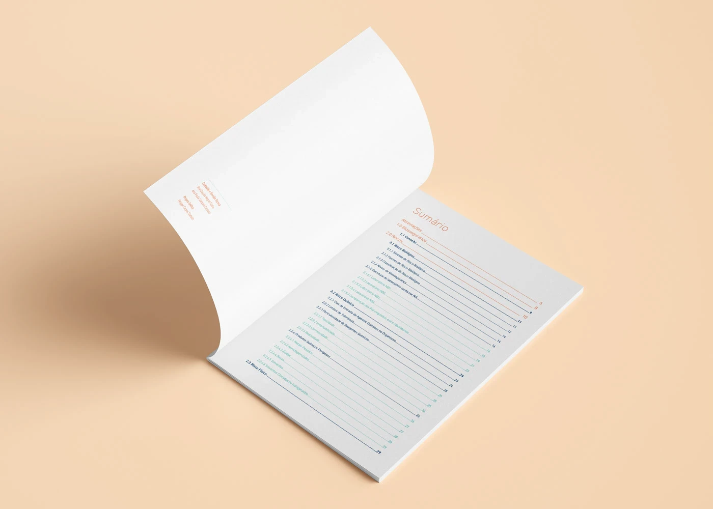
Information Hierarchy
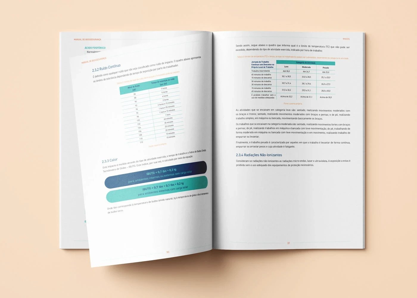
The content was reorganized using a clearer hierarchy of titles, subtitles, and paragraphs. This structure allowed readers to quickly identify sections and understand how information was organized.
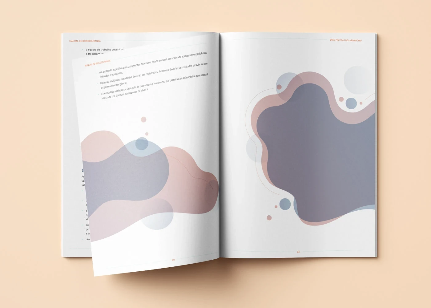
White Space and Layout Balance
One of the most impactful changes was the introduction of intentional white space.
By creating breathing room between sections, paragraphs, and visual elements, the layout reduced cognitive load and made the document significantly easier to read.
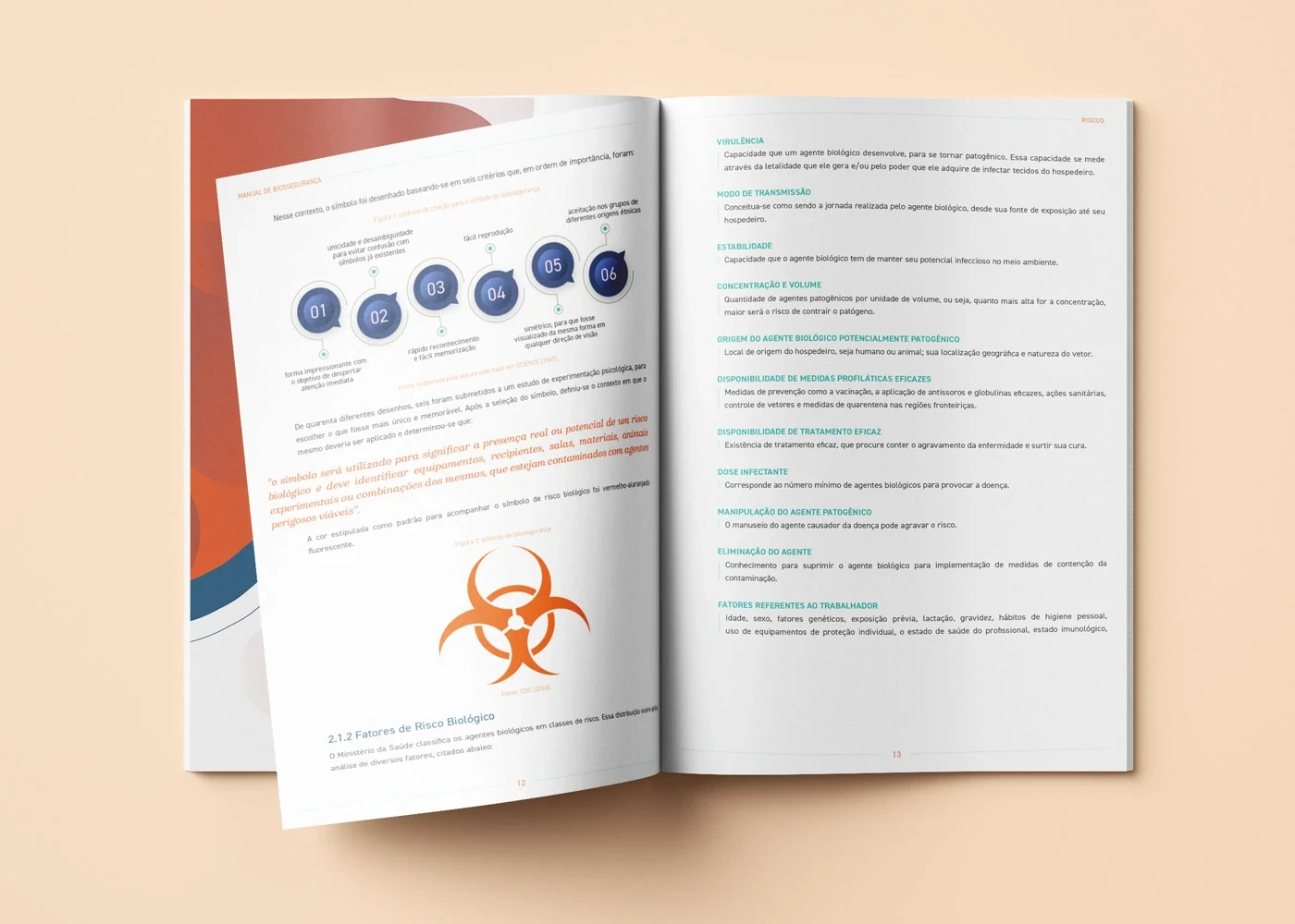
Visual Guidance
Illustrations and infographics were integrated throughout the manual to support the written content.
These visual elements helped clarify procedures, reinforce key information, and guide readers through complex topics more intuitively.
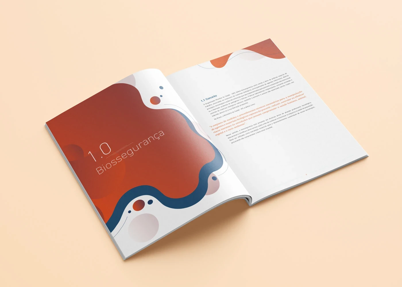
Color System
Color was introduced strategically to improve orientation and navigation within the document.
Different sections were visually distinguished, allowing readers to quickly locate relevant topics while maintaining a consistent and professional visual language aligned with an academic institution.
Information Design
The project relied heavily on information design principles, translating dense technical material into structured visual communication.
Text blocks were broken into smaller sections, key concepts were highlighted, and visual diagrams were used to simplify complex procedures.
The result was a document that preserved its technical rigor while becoming significantly more approachable and easier to navigate.
Outcome
The redesigned manual transformed a dense technical document into a structured and visually engaging publication.
By improving hierarchy, spacing, and visual support, the manual became more accessible for readers while maintaining the precision required for biosafety guidelines.
The project demonstrates how thoughtful editorial design can enhance the usability and clarity of technical documentation without altering its content.
My Role
Editorial Design
Information Design
Layout System Development
Infographic Integration
RECENT WORKS